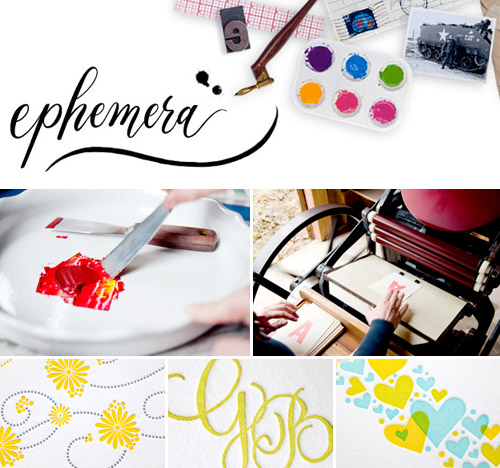
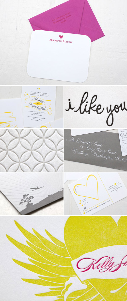
It’s giveaway time again – hooray! And this week’s items up for grabs are something that EVERY couple can use during their wedding planning process – thank you notes! Designer Tara Bliven from Ephemera has been creating colorful, creative and fun wedding invitations and stationery from her Washington studio since 2006, and she recently launched a number of easy-to-order online collections. To celebrate, today she is generously giving away a set of personalized letterpress note cards and envelopes to one lucky Junebug reader. How perfect is that?
Here’s what our winner will receive:
· 50 soft white flat note cards (1 or 2 ink colors)
· 55 soft white printed envelopes (1 ink color)
· Winner can choose from the Monogram, Symbol, Whimsy or Connection designs, and choose their ink color(s), fonts, and text.
· Ephemera will supply up to 3 digital proofs to get it looking perfect, and then letterpress print and ship it to them for free! A $500 value!
These would make great thank you cards for your wedding, or lovely notes for everyday use. To enter to win, simply visit www.Ephemera-Press.com and then leave us a comment here letting us know which of her whimsical collections are your favorite, and how you would personalize them and use them for your own wedding. We’ll accept entries all week long and choose our winner next Monday, April 11, 2011. UPDATE: We have a winner! Congratulations to Nicole who said “i adore the whimsy collection! the design would go perfectly with my decor, and my family and friends would love receiving them!” And thanks so much to all who entered to win!
In addition to the giveaway, Tara has set up a 10% off coupon code just for Junebug readers! Through May 1, 2011 you can receive 10% off any online orders of thank you notes, stationery, wedding invitations and more (excluding completely custom designs) by using the code JUNEBUG at checkout. Thanks Tara! Here’s a little more information about her new online collections:
“In general, the customization process for our new online collection is super-simple. You can shop online and choose the design you like best. Each design has several individual items available from invitations to replies, menus, note cards for thank yous, baby announcements, etc. You customize the colors, fonts, papers, and text and submit your order. Every online order comes with 3 digital proofs so we can get it looking just right for you, as well as free ground shipping! In addition to our online collection, we also love to do custom work and calligraphy services for that final, perfect touch.”
Good luck everyone!






.jpg)

I would choose the “Connection” collection. Love the contemporary look, but still classic enough to use for my thank you cards to grandma’s and great grandmas. I would love to have some letterpress, i wasn’t able to fit it in my budget for the invitations, but it would be perfect for the thank you cards!
The flight is my favorite!!!! Matches my personality ;)
My fiance and I are always writing notes to eachother…to leave on the breakfast table or bathroom shelf before work as a little suprise. The love notes from Ephemera would be a lovely suprise from me to him one morning! For thank yous we would choose the symbol in green and orange as hearts are part of our wedding vision.
I love the whimsy collection. So playful yet elegant. I don’t have a wedding in the near future..nor a man..so it’s hard for me to imagine how I would use them, ha.
Definitely the monogram collection! We are having a DC wedding and want to have a stately looking monogram, so these would fit in perfectly!
Hey Junebug! I’m a Puerto rican bride who is “obsessed” with everything wedding, junebug and of course letterpress. Love, love all of Ephemera’s Collections, but if I had to choose one that would be the Monogram Collection. It is just breathtaking and it goes perfect with the theme of our wedding: “Romantic Glam”. We would definitely use them as thank you cards!! We want everything grand and spectacular, and we sure need to finish it all out with a bang!!! We would personalize them using the colors: blush, and silver or gray; the font: Upright. and the paper and envelope: soft white xoxo Nichole
Love the simplicity of the symbol collection but I can’t decide between the heart or the key (#2)! The heart would definitely be in papaya – probably with tangerine lettering. For the key, I’m leaning towards gold with aubergine lettering. EIther way, they would be perfect for our thank you cards :) Thanks for the great giveaway!
I Love the Connection collection. It’s perfect for our color scheme of gray and yellow. To personalize it for ourselves, I would perhaps add our names or initials and ask for perhaps one or two circle to be in a yellow color.
I love the monogram thank you cards. I think a monogram is timeless and classic.
What a fantastic giveaway! The Symbol collection is so fun, but I really like all of the collections!
I love the Symbol collection and I would customize it with the “I Like You” tag on… My finance and I say “i like you” to each other as a sign of affection…sometimes liking means even more than loving! I would like to use these to write a welcome note to each of our guests. Ambitious..yes, but we have a full year to go!
I love the classic look of the monogram thank you note cards in silver. Awesome giveaway, hope I’m lucky enough to win!
the Love notes are by farrrr my favorite!
I like the whimsy collection. I think I would choose a yellow and chocolate brown color scheme that would compliment our fall wedding colors.
Wow! Its so hard to choose because they have such beautiful work! I definitely think I like the whimsy collection the best though, they would go super well with our garden wedding…. Thank you!!
I love the whole whimsy collection!
How pretty! I love the monogram. We’d have it in grey. classic. thanks!
The flight collection is awesome, a sweet symbol made a bit bold. Perfect to use for the myriad of thank you’s, but I’d use it for everyday notes just as well.
I love the symbol collection and would personalize them with our names for use as thank you cards and correspondence (with cobalt blue ink!)
I love letterpress! The symbol collection is great and would be wonderful to use to leave notes for out of town guests for our wedding. The entire collection is beautiful!
What an awesome giveaway! I’d use the Connection collections, as I’m an ecologist and my fiance is a computer scientist, and we both love math. While we’d keep the colors simple – blue and black – we’d probably draw math and circle-related doodles on the backs of each card (we’re huge fans of Vi Hart). Maybe sin/tau pie charts. We’d order the thank you cards without ink on the circles so we could highlight two circles for the occasion. We’re already planning to have some ecology-related in-jokes, so something to cater to our math interests would be wonderful. My fingers are crossed!
I love the Love collection! It’s such a clever use of the print overlaps. I would customize it with shades of teal/aqua and send little love notes to clients and other vendors!
I love the classic Monogram collection! We’re having a traditional Southern wedding so those thank you notes would be perfect. I’d personalize them with our wedding colors (yellow & poppy red) to tie everything together.
YES PLEASE!!!!!!!! Yes yes yes!!!! I love love love love loveeee the Whimsy collection! I would LOVE to win this, of course… who wouldn’t! Crossing my fingers =).
So pretty! I like the “Connection” series. I would put our first names in Feel Script in Rose or Pappaya to match our invitations and the rings on the bottom of the card in Chocolate ink.
Seeing “connection” my heart just stopped! Letterpress was the one thing that taunted and teased me through this whole wedding process. Especially since I’m the girl that cuts from the flower budget to add to the paper budget! After battling with the idea for months, (to my fiance’s delight) my determination to stick to the budget sadly won — I DIYed my own invites and told letterpress we’d meet again (maybe for my daughter’s wedding one day??) Now, after seeing this on your blog, I feel like it must be fate. “Connection” is a *perfect* match to my homemade wedding suite! I would die to use these as my thank you cards and fill that one void in what otherwise has been a dream wedding planning process. I would make them match my invites to a T with our names in the class Burques Script and the interlocking circles in tangerine or fuchsia. SWOON!!!!
My favorite is the Whimsy collection. We’d go with the yellow that is featured in the images because that fits into our color scheme! We’d pick a font that mimics an antique typewriter!
Wow…these are charming! I’m kind of torn between the “connection” foldover notes, which are classic and the symbol foldovers, which can be a little more quirky. For wedding thanks you’s, I’d go with the connection set. I’m such a font nerd that I’d have to try out a different font…maybe something even more elegant. The ink choices are so numerous…I’m not sure what I’d do in that area!
I love the Whimsy collection. It would “go” perfectly – bright yellow flowers and its just sweet and not fussy. We plan on having a lot of yellow and muted teals and such, and daisies are certainly our flower. :-)
The love notes are sweet!
This is great! We love the Love Detail & the Theodore Detail collections. We’ll be sure to include this in our giveaways blog that we run on Thursdays- be on the lookout for it! (blog.weddzilla.com) Thank you for the opportunity!
I love the monogram information cards! That would be perfect for our guest welcome baskets since most of our family is heading to our wedding from out of town!
Greetings! Definitely the “Connection” collection. These could be used for thank-you’s of any sort, not just for weddings. BH
The Monogram is my favorite. I would love to get something monogrammed with JB, which will be both mine and my fiancee’s initals after we get married to use for our thank you notes.
The “Connection” style fits our gorgeous tile-filled wedding venue BUT we both LOVE “Flight”! We are a funky, colorful couple who are madly in love. And we are in dsperate need of invitations and paper products soon… I’m excited to learn about this site!
gorgeous! i would pick the “connection” collection – i love the simplicity and would love to customize a unique color combination! thanks!
I absolutely love the symbol collection. my fiance is designing our invitation and has already included mini hearts. the symbol thank you notes would be a perfect compliment.
I am absolutely tickled pink with the Monogram Information Card. I would love it in soft white with my name in the chocolate ink and the monogram in fucshia. I would use them as calling cards, I want to bring them back!
I love the Connection collection. I would say “Thank You” at the top in red, possibly with our names underneath, and then the pattern in brown bag. For the font, I might have to go with Classic although I really love Dearest and Feel too.
I love the simplicity of the “symbol” collection. If possible, I would do a bike or tandem bike as our symbol, because that’s part of our wedding theme! The place we’re getting married doesn’t allow cars, only bikes…plus they are cute and symbolize adventure and the journey ahead :)
I love the whimsy collection ! Young and fun but elegant.
I love the symbol collection. The heart is just right and perfect to send as thank you notes for a bridal shower/wedding.
I would definitely choose the symbol design with the heart. So simple and sweet – would love to use them as thank you notes!
i would choose the monogram collection with the upright or casual font in red ink on brown bag or putty paper to go with our scandinavian folk/craft themed wedding!
Monogram all the way!
I love the symbol collection. It’s perfect for wedding thank you notes!
I really like the connection collection. It’s modern and clean and classic looking.
I love whimsy! Or symbol…it’s so hard to choose when they are all so adorable!
I love the “Connection” design for its geometric print. It’s perfect for our wedding since we’re going for a fresh, clean and modern look!
I love Whimsy!!
I love the Connection collection. I’d love to use them for my Thank you notes! I’ve already started getting gifts….
I absolutely love the Connection collection! So beautiful!
i adore the whimsy collection! the design would go perfectly with my decor, and my family and friends would love receiving them!
i love the love notes! my friends would love them
My partner and I are very simple people so the Connection collection would be perfect for us. I love how the letterpressed motive is bold enough to have it’s place on the page, but subtle at the same time so that it doesn’t overpower the words. I’d personalize them by picking dark grey for the main text and deep purple for the highlight text, which are the colours for our wedding.
Monogram for thank you notes at each guest’s seat at the reception…a personalized little “thank you for being here. you are so special to us”…(Although I’m also quite partial to the “I like you” little snippet showing up above!)
The whimsy collection is so adorable and perfectly suited to my wedding!
I love the heart symbols and the whimsy collections~perfect for writing notes to family and friends!
I love the ‘connection’ collection! These cards would make perfect thank notes for our November wedding.
I love the monogram collection. It is so classic and beautiful, plus I think our monogram will be neat since both our first names start with a K :).
I love all things monogrammed – so I would definitely pick that. I would choose the colors of our wedding which include a cranberry red.
I absolutely love the monogram collection. I am so incredibly excited to become Mrs. Pope and have been hoping to create a monogram to use for our wedding Thank You cards. These would be amazing!
Ephemera is great! I think the Symbol collection is wonderful and I would use them to send sweet thank you cards!
Definitely the classic monogram collection! Love this!!
I love the symbol collection! We actually used a little heart symbol in our save the dates and invitations, so this would work perfectly for thank you cards! I would customize it by using pool ink.
I love all the collections but I would definitely go with the monogram. I can think of tons of uses for these cards! I have so many people that I need to thank!
The Connection Collection is my favorite. I LOVE LOVE LOVE the folding Thank You card, so much so, that I’m not sure I would be able to give them away!
I LOVE the Monogram design … these would perfect for our wedding thank you notes … our theme is “classic” and “fun” … this fits the bill!
I love the monogrammed notes!!!
I would choose Connection – in a true blue/spring green combo or maybe a grey and bright green combo or – I could go on forever!
OH! And I’d use them for anything – my wedding and then just my personal correspondence after that!
I love SYMBOL!! I love the heart! They would make beautiful thank you cards!!!! I have been looking for some that are as cute as these!
I love the connection thank you notes. Artistic and understated…perfect for my wedding at an art museum!
I fancy the whimsy collection- delightful and classy! I would choose it either in black or perhaps a bright teal. Beautiful work Ephemera!
OhMyGoodness!! Tara is SO talented!! What an amazing giveaway!! I can’t decide if I love the whimsey more…. or the symbol ones…. both are SO gorgeous!! Okay – I think the Symbol cards would be PERFECT!!! Whoever the winner is… will be SO lucky!!!
I would get the thank you note cards (flat) in Whimsy, in peacock blue and navy. I’d use them for thank you cards.
I would totally do Symbol… but what a hard choice. Everything looks so beautiful!! I’d definitely opt for a coral and gray palette. Looove.
no question about it – monogram – in all black with just the monogram and our names in blue – so classic and lovely! letterpress is one of those things that I love, but is just out of reach budget-wise…here’s hoping :)
I love all things monogrammed! Would be perfect for writing love letters!
I love the symbol collection! My fiance and I are planning a fall wedding. We’ve been looking at letterpress but both of us feel that it’s all a little formal for us. However, I think the darling little heart on these is just the right amount of color, but keeps within our simple handmade theme! I’m sure we would use them for thank you notes, I can see them now. Absolutely darling! :)
I love the Whimsy Detail collections. I get a relaxed feeling when I look at them. That is the exact feeling when I think of what I want our wedding to feel like.
I love the “connection” look! Would go prefect for my upcoming knot tying in the fall!!! Love love love!!! -Katie
LOVE, LOVE, LOVE the connection collection! A great way to get connected to all the lovelies in your life!
It’s a tough choice, but I think I would pick the monogram collection for thank yous. Both my fiance and I would love to win – thanks so much for the chance. I would do them in gold ink! I also adore the 2011 love notes – my fiance travels a lot for work, and we hide notes for each other before he leaves! Thanks for the chance to win!!
I absolutely LOVE the connection notes! (http://ephemera-press.com/item.php?item_id=4&category_id=5) SO cute!
love love love the monogram collection!
I love the Monogram. So fun, yet elegant!
I love those simple single hearts ones :)
I love the Whimsy collection! the design is eyecatching!
I love the symbol collection! We’ve passed the thank you card part of our wedding, but we would most definitely use these for future thanks! I think we’d personalize it with a little bird, similar to the ones we had on our invitations.
Since first finding Ephemera after my second son was born, I was hooked. We use them for everything that requires a card of any kind – thank you’s, love notes, invitations…We are planning a special vows ceremony for our 10 year anniversay and already know that we will use Symbol. We love Whimsy & Monogram as well – how can you not? I use Symbol note cards for Valentine’s every year for all my friends and co-workers!
I really like them all! They are gorgeous. My first choice would be the monogram or symbol note cards. Thanks!
I would just love to win this prize. I like the symbol collection for it’s simplistic style. I have just launched a new business so this would be perfect to use for stationary and thank you notes!
I love love love the calligraphy detail one. It fits with my invites and all my other printed materials. :)
LOVE the symbol cards – I’d get our first names in blue.
I’m loving the “Symbol” collection – the heart is so simple and sweet :) Perfect for those after the wedding thank-you cards! I especially love it in bright pink.
I love monogram and connection, I want to use one for my graduation announcements And the other for my wedding, I can’t wait to pick a color scheme w my husband to be!
I absolutely LOVE letterpress!! My fiance and I really loved the simplicity and classic elegance of the “Monogram” collection.
I absolutely adore the symbol collection! SO CUTE! My fiance and I are incorporating love birds, so sending these thank you notes with a little bird on them would be perfect!! I would also make the font color plum, so classic.
I’d choose the Symbol collection and customize it with a font in aubergine. I think I’d see if the heart could be changed to a sailboat- our wedding is on the beach. The seashells work, too!
Love the Whimsy collection! I will print them in peach and add a gold sash to match my wedding color!