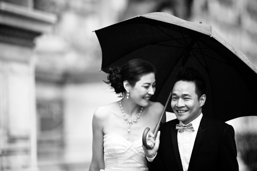
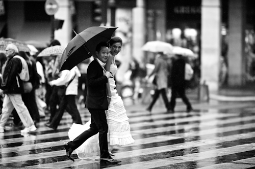
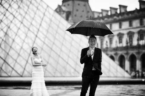
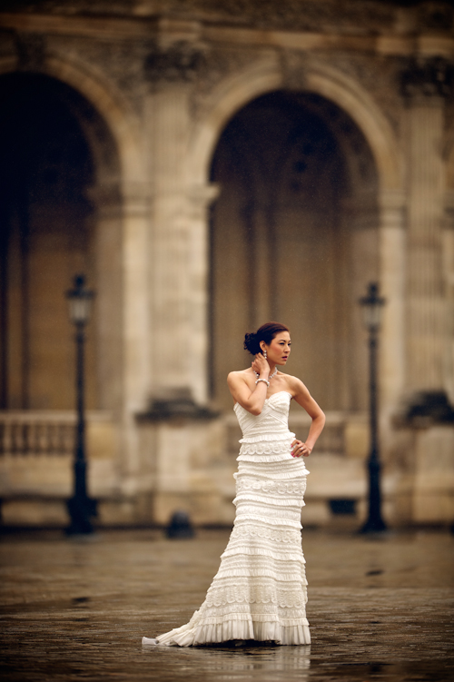
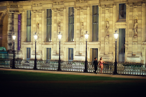
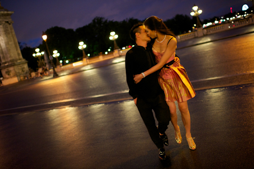
Cynthia and Eddy’s Paris honeymoon sounds absolutely dreamy! Long drives along the coast, sunshine, wonderful meals, castles…the list goes on and on. But one of the best parts was the surprise that groom Eddy planned for one of their last days. He had fantastic photographer David Wittig capture the couple enjoying what might be the most romantic city on earth – Paris. Beautiful bride Cynthia donned her wedding dress again to accompany her handsome husband through the city streets in the moody, oh-so-Parisian rain. Their pictures are the perfect honeymoon souvenir in my book!
From bride Cynthia: Our wedding was held in September 2011 in Hong Kong, our hometown. I can’t believe it has already been a year! We planned our honeymoon for June of 2012. It was a two-week journey through Italy and France. We flew from Hong Kong to Milano, and then started driving. We went through the border to Monte Carlo, then along the Cote D’Azur. The weather was wonderful – sunshine always seems to follow us. We also loved the seafood and wine every night. After Monte Carlo, we stopped by Saint Tropez and Carcassonne, where we stayed in an interesting castle. Then, we drove to Bordeaux and Tours, where we stayed in Chateau de Brissac. Some of our happiest moments took place there. The second to last stop was Mont Saint-Michel. After that, we arrived in Paris.
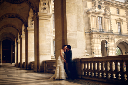
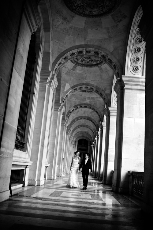
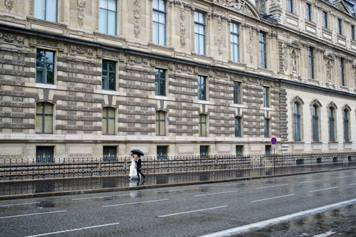
I had been told that Eddy had arranged a professional photographer for a honeymoon shoot in Paris, the last stop of our whole journey. It was a big, pleasant surprise. Unfortunately, the photo shoot day was raining and dark, and without any sunshine, it was pretty cold. I was a bit upset and worried at the beginning. It was difficult for me to do the shoot with cold and wet weather, but Eddy is always positive. He said our pictures would be very unique with the rainy atmosphere, and they were being taken by an amazing photographer who would adapt to the weather. His words warmed me up. Both of us are very happy and love our pictures!
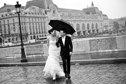
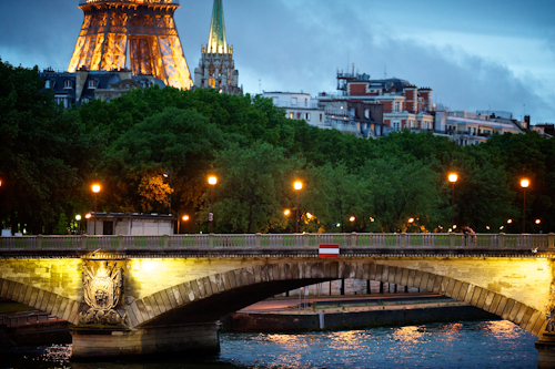
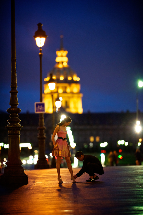
From Photographer David Wittig: Eddy and Cynthia live in Hong Kong and were married last year. Eddy then spent a few months planning the ultimate romantic honeymoon…a drive along the Ligurian coast to Monaco, a stay in a private chateau in the Loire Valley, and a few days of shopping in Paris. He also contacted us to fly over and photograph some of their romance around Paris. The day we were shooting, the weather changed as if on cue, from the warm summer days they’d been having, to the picturesque cold and rainy days that Paris always seems to dress up in for photographs. While this made the logistics of the shoot a little more challenging, they braved the cold, and it all looked perfect in pictures. Eventually the rain let up, and we headed out for some pictures at night in the City of Lights. They changed from their wedding attire into evening wear while our makeup artist gave Cynthia a more dramatic, evening look. The rain from earlier in the day left the streets glistening and the colors crisp and saturated – simply perfect conditions for us.
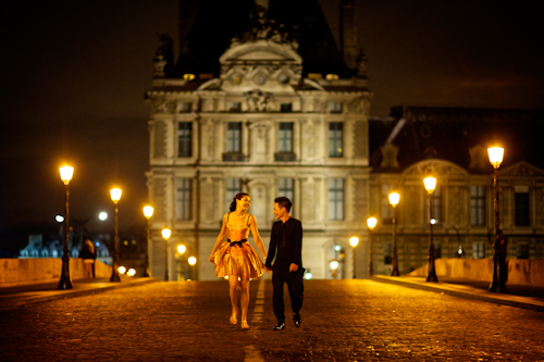
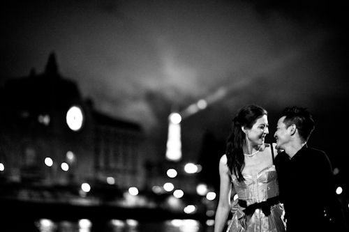
The Photo Shoot Team:
Photographer: David Wittig Photography
Wedding dress: San Patrick
Evening dress : Louis Vuitton
Bridal shoes : Pilar Burgos and Stuart Weitzman
Groom’s suit : Christian Dior
Evening apparel : Miharayasuhiro
Groom shoes : Gucci
Thank you for sharing your beautiful day in Paris with us Cynthia and Eddy!







.jpg "Photographers")